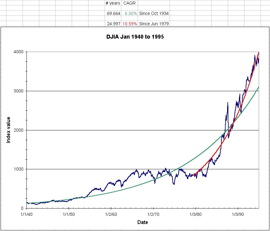
This is an interesting chart which I found at Motley Fool. I can not verify its accuracy.
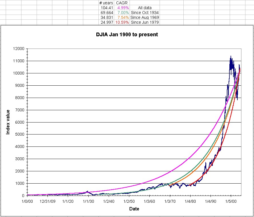
Here is a current graph for the Dow Jones Industrial Average
Start date is Jan 1900 (since that’s the earliest date Excel can work with)
CAGR lines are for all data (104 yr), 70 yr, 35 yr, and 25 yr
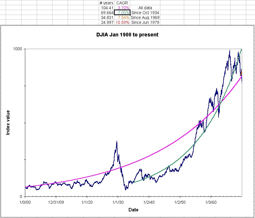
Here is a zoom in on the data from 1900 to 1970.
Note that a 3.7% CAGR seems to fit this better than the 4.99% 104-yr line did, above.
Note that from 1935 on, the 7.00% CAGR fits it quite well
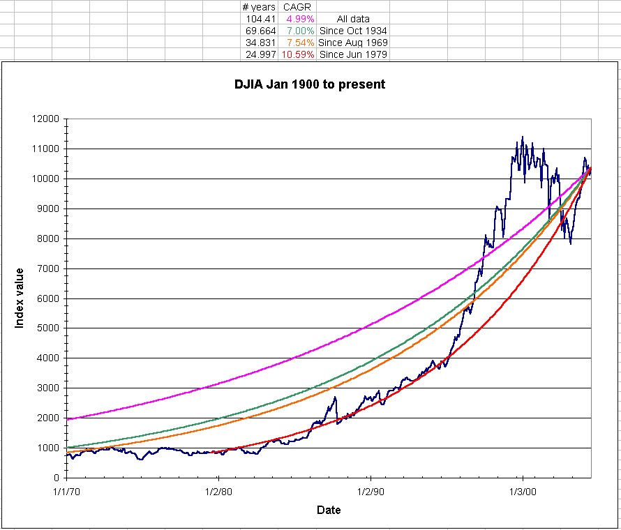
Here is a zoom in on the data from 1970 to present.
Note that the CAGR lines established from earlier (purple especially) do not seem to fit this data very well.
The orange and green lines track pretty well together, but still do not fit very well.
Note that from 1980 on, the 10.59% CAGR fits it quite well, and undercuts the bubble.
Here is a zoom in on the data from 1940 to 1995 – close to what BMW saw.
Note that the 6% CAGR lines seems to fit this data somewhat well.